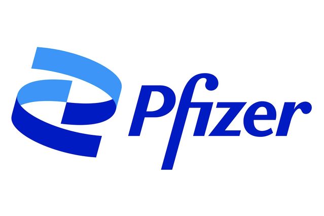
Pfizer International, the global leader in the pharmaceutical sector, recently unveiled a newly created logo that updates its trademark’s graphic elements. The launch began with a little film in which they explained the rationale using beautiful sentences they carefully crafted using language care, conveying their viewpoint on their organization and its overall entity (its position in the audience’s mentality).
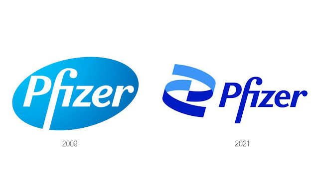
And why should a huge, globally recognized institution renew its logo, we could wonder?
The answer will be given from all angles and by both specialists and non-specialists, and it will unavoidably be that the global brands are keeping up with and modernizing the development of their brands in order to confirm the presence of the brand in the market, its significance, and to remind consumers of its area of expertise, mission, and purpose.
But if we ask, “Why now? , yes now! by drawing your attention to the fact that, between the end of 2020 and the beginning of this year, we have witnessed widespread government and international organization approval of the Pfizer vaccine against the well-known and dangerous epidemic known as COVID 19, which has “filled the world and people with concerns”!
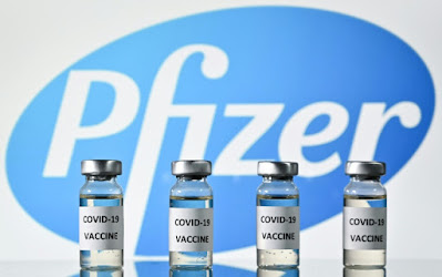
In order to answer the question “why now?” from a specialist communication perspective, we must first examine the information the company has provided on its website and social media platforms. Then, we will ensure that the visual change in the logo and other visual elements is to reinforce a fundamental philosophy behind a strategic goal that they intended to share with the world at this specific time. Here I’ll attempt to justify (at least for myself) the little modification to the logo while praising how cleverly the optics were connected to the messages they sought to send to us. What did their campaign for this development contain? I will express their argument and provide you a clear, concise explanation in the lines that follow.
“After more than 170 years of treating diseases, we have reached a new age, a period when we focus intensely on research and dedication to patients,” they say in the brand’s introductory video. Our new brand identity is a symbol that communicates our mission to improve patient lives whilst healing humanity from disease.
Notice how the two blue arcs move in the video; these arcs used to create the “oval pill” symbol in the previous logo. They arranged them to create a coding for the DNA chromosome’s shape, which they said in the texts is based on the core principles, passion, and objective of their institution, which is to progress science and benefit humanity.

Here is displayed the main message intended to be conveyed to the company’s philosophy and strategy, namely that they are a company that cares more about development and research through scientific laboratories and in-depth studies than they care about being a drug manufacturing company concerned with profitability, trade, and selling commercial drugs.
They refer to all of us as Corona infected, potential infected, or Corona worried. We are frightened of receiving the vaccine and the concept behind it. They send us messages assuring us that your vaccine is in safe hands. It took years of research, development, and testing to create your vaccine. He shackled her and put it on her. It is not a universal treatment provided by governments to the people.
While we are optimistic, or even compelled, it is not for me to take it. It is a fantastic drug that was discovered in the research labs of this enormous institution, which shows clearly that it is cautious about the planet and also us. It automatically moves to something superior to profitability, monopoly commercial benefit, and non-military dominance in its mental position!
Let’s read what Albert Bourla, the company’s chairman and CEO, said, basically restating what was mentioned in the opening segment of the video: “After 171 years, a new era has begun, one that is heavily focused on research and its commitment to patients’ wellbeing. Pfizer is no longer involved in the field of disease treatment only!” While highlighting the company’s leadership, the Deputy CEO and Chief Corporate Affairs Officer said: “Our new identity represents the authenticity of Pfizer’s history and exhibits the creative spirit and attention on the reality that science and research are the cornerstone of work in Pfizer.”

We first looked at the development of their logo since 1849 , which underwent six modifications with this new one, and how they relied on the blue color, which psychologically and scientifically confirms confidence and transparency. As for their exhibition of the details of identity, its technicalities, and the causality of their choices for visual details (which I personally considered minor but indicative), Credibility was added when they took a brand-new degree with gradations from it and declared, “Blue, but new.”
Additionally, they described the font they chose in the brand name and the reasons they decided to use it as a universal font that can correctly write all Latin characters. They stated that it is a serious, sharp-angled font that reflects their personality because they take their position seriously.
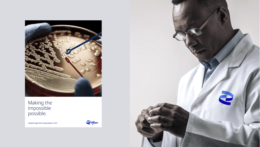
They employed a realistic image collection of real people in positions, ages, and bodies that indicated they were the ones in need of medical attention, along with medical teams and cadres who dealt with them with kindness and professionalism that was obvious from their body language and facial expressions.
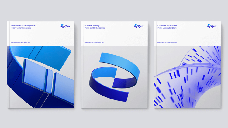
In order to express and consecrate their new identity, they also used digital graphics that maintain the interlocking arc shapes that directly refer to the DNA chromosome they adopted to express their new identity

Back to causation finally! From a specialized perspective, I can see that they were successful in both the timing of the launch and the proposal itself. Additionally, I can see that the motivation behind offering this development was very justified in an effort to relieve public concerns about the vaccine they released to the market and the rushed adoption of it by governments over other vaccines that were available. Did the message reach you? Are you persuaded by their argument? The only thing I want for each of us is to be free of the burden of this nightmare.
